Responsive HTML Email Development
Mobile email usage exceeded desktop and webmail some time in 2013, and the smart money says that the mobile takeover is far from finished. Mobile-optimised emails that look great on the small screen aren't just a nifty extra, they're the key to getting the best response and ROI from an email campaign.
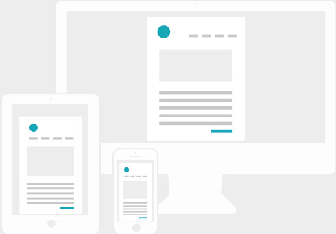
An email that looks great on a desktop email client like Outlook or Gmail is going to be somewhere between a bit awkward and outright miserable to read on a mobile device like an iPhone. Tiny text, lots of pinching and zooming to move around, little buttons that are hard to hit with clumsy fingers… all pretty disengaging stuff. Responsive emails adapt to the device on which they're being viewed - wide images can be swapped for a more appropriate size and shape, font sizes can be increased, buttons can be made larger and easier to tap, columns of content can be stacked and re-ordered… much better.
With a bit of forward-planning in the design phase, the vast majority of emails can be built to be responsive. Give us a call on 01189 778 578 for a helpful, informal chat.